Show Grid
Classes
ALUX v3.0 · The Fast HTML5 Framework for Awesome Light User Experience
ALUX is a Lightweight Framework (~40K) for Creating Super-Fast and Beautifully Responsive Web Apps.
The Framework is built with HTML/CSS and pure Javascript.
Dependencies Free, no jQuery but with a wide range of features:
Grids, Sliders, Menus, Animations, Typography, Forms, Buttons & more.
Easy, Light, Fast, Flexible.
Examples: Double Footer Mobile Menu - White Version (NEW!)
Home Cover - One Page Landing - Home with Full Slider (NEW!)
DOWNLOAD Git Hub
Usage
Once you have downloaded ALUX, the first thing you need to do is include the CSS and the JavaScript.
CSS
<head>
      <link rel="stylesheet" href="path/to/alux.min.css">
  </head>
Javascript
<script src="path/to/alux.min.js"></script>
Icon Svg
After this add alux-arrow.svg in the project folder. (used in menu & slider)
01. Multiple Grids
The grid system use classes and % to define column widths. Example: for a columns 50% of the screen width use .col-50.
You can use these columns width: CSS classes:
100% - 1 column grid (auto width) .col
50% - 2 columns grid .col-50
33%, 66% - 3 columns grid .col-33, .col-66
25%, 50%, 75% - 4 columns grid .col-25, .col-50, .col-75
20%, 40%, 60%, 80% - 5 columns grid .col-20, .col-40, .col-60, .col-80
16% - 6 columns grid .col-16
12% - 8 columns grid .col-12
10%, 20%, 30% [...] 90% - 10 columns grid .col-10, .col-20, .col-30 [..] .col-90
<div class="grid">
  <div class="col-50">
        50%
  </div>
  <div class="col-50">
       50%
  </div>
</div>
02. Auto Width Columns (thanks flexbox!)
You can combine every colums width .col-% with a fluid flexbox "auto" witdth colum .col
<div class="grid">
    <div class="col-16">
       16%
    </div>
    <div class="col">
      auto
    </div>
  </div>
03. HTML5 Structure
Add classes to HTML5 Tag for light and (almost) semantic markup.
<div class="grid">
    <article class="col-70">
        70% article
    </article>
    <aside class="col-30">
       30% sidebar
    </aside>
</div>
04. Full Width Grid
For a grid using the full width of the screen, use .grid--full
<div class="grid grid--full">
  <div class="col-50">
     50%
  </div>
  <div class="col-50">
    50%
  </div>
</div>
05. No paddding Full Width Grid
For a full width grid with no padding, use:
<div class="grid no-pad grid--full">
  <div class="col-50">
    50%
  </div>
  <div class="col-50">
     50%
  </div>
</div>
06. Columns Alignment
ALUX allows you to align columns in every base grid with the classes .grid--center, .grid--right.
The push system works on both Tablet and Desktop.
<div class="grid grid--center">
  <div class="col-40">
    40%
  </div>
</div>
07. Mobile Options (try resize the Screen)
The columns on Smartphone are 100% of the width. The columns on Tablet are the same of the desktop. You can overwrite the default width of a columns on the Smartphone & Tablet view by using the following classes: .sma-% and .tab-% (% => 10, 20, 30 [..], 25, 33, 50, 66, 100).
For example: tab-33 sma-50
25% .col-25 tab-50 sma-50
25% .col-25 tab-50 sma-50
<div class="grid">
  <div class="col-25 tab-100">
    25%
  </div>
  <div class="col-25 tab-100">
    25%
  </div>
  <div class="col-25 tab-50 sma-50">
    25%
  </div>
  <div class="col-25 tab-50 sma-50">
    25%
  </div>
</div>
08. Push & Pull Columns
You can push & pull columns with .push-% (% => 10, 20, 30[..], 25, 33, 50, 66, 100). The pull system works on both Tablet and Desktop.
<div class="grid">
  <div class="col-70 push-30">
    Content
  </div>
  <div class="col-30 pull-70">
    Sidebar
  </div>
</div>
09. Auto Width Mobile (thanks flexbox!)
You can combine the "auto" width of flex-box with the mobile columns.
<div class="grid">
      <div class="col tab-100">
        auto
      </div>
      <div class="col sma-50">
        auto
      </div>
      <div class="col sma-50">
        auto
      </div>
      <div class="col ">
        auto
      </div>
      <div class="col ">
        auto
      </div>
    </div>
09.1 Nested Grid
You can nested Grid how many times you need.
Sidebar
20% .col-20
- Link
- Lorem link
- Ipsum link
Content
80% .col-80
Nested Grid Col
30% of 80% .col-30
Nested Grid Col
70% of 80% .col-70
Nested Grid Col Mobile
33% of 70% .col-33
Nested Grid Col Mobile
33% of 70% .col-33
Nested Grid Col Mobile
33% of 70% .col-33
<div class="grid">
  <div class="col-20">
    <h4>Grid Column</h3>
    <p>Lorem ipsum dolor voluptatibus.</p>
  </div>
  <div class="col-80">
    <h4>Nested Grid Column</h3>
    <p>Lorem ipsum dolor sit  adipisci bus.</p>
    <div class="grid">
      <div class="col-30">
        <h5>Nested Grid of Nested Grid Column</h5>
        <p>Lorem itaque distinctio iure voluptatibus.</p>
      </div>
      <div class="col-70">
        <h5>Nested Grid of Nested Grid Column</h5>
        <p>Lorem itaque distinctio iure voluptatibus.</p>
      </div>
    </div>
  </div>
</div>
10. Grid No Col
You can set a grid with no columns to contain any content you like:
No Colums only the container .col
<div class="grid no-col">
  No Colums only the container
</div>
<div class="grid no-pad-menu">
  <div class="nav-wrap">
    <div class="nav-header">
      <a href="#" class="logo">ALUX</a>
      <div class="tog" data-target="menu-sub">
        <span class="animate"></span>
        <span class="span-middle animate"></span>
        <span class="animate"></span>
      </div>
    </div>
    <nav id="menu-sub" class="nav-container">
      <ul class="primary">
        <li class="dropdown">
          <a href="#" data-toggle="dropdown">Products <div class="alux-arrow animate"></div></a>
          <ul class="dropdown-menu">
            <li><a href="">Shoes</a></li>
            <li><a href="">Jacket</a></li>
            <li><a href="">Hat</a></li>
            <li><a href="">Coat</a></li>
          </ul>
        </li>
        <li class="dropdown">
          <a href="#" data-toggle="dropdown">Services <div class="alux-arrow animate"></div></a>
          <ul class="dropdown-menu">
            <li><a href="">Delivery</a></li>
            <li><a href="">Support</a></li>
            <li><a href="">Customize</a></li>
          </ul>
        </li>
        <li><a href="#">About</a></li>
        <li><a href="#">Contact</a></li>
      </ul>
    </nav>
  </div>
</div>
<div class="nav-wrap">
  <div class="grid no-pad-menu">
    <div class="nav-header">
     ...
    </div>
    <nav id="menu-sub-2" class="nav-container">
      <ul class="primary">
       ....
      </ul>
    </nav>
  </div>
</div>
<div class="nav-wrap nav-double mobile-footer-menu nav-fixed nav-light">
    <div class="grid no-pad-menu">
      <div class="nav-header">
        <a href="#" class="logo">ALUX</a>
      </div>
      <div class="tog" data-target="menu-double">
        <span class="animate"></span>
        <span class="span-middle animate"></span>
        <span class="animate"></span>
      </div>
      <nav class="nav-container animate" id="menu-double">
        <ul class="primary primary--left">
          <li class="dropdown">
            <a href="#" data-toggle="dropdown">Products <div class="alux-arrow animate"></div></a>
            <ul class="dropdown-menu">
              <li><a href="">Shoes</a></li>
              <li><a href="">Jacket</a></li>
              <li><a href="">Hat</a></li>
            </ul>
          </li>
          <li class="dropdown">
            <a href="#" data-toggle="dropdown">Services <div class="alux-arrow animate"></div></a>
            <ul class="dropdown-menu">
              <li><a href="">Delivery</a></li>
              <li><a href="">Support</a></li>
              <li><a href="">Customize</a></li>
            </ul>
          </li>
          <li><a href="#">Contact</a></li>
        </ul>
        <ul class="primary primary--right">
          <li class="dropdown">
            <a href="#" data-toggle="dropdown">Products <div class="alux-arrow animate"></div></a>
            <ul class="dropdown-menu">
              <li><a href="">Shoes</a></li>
              <li><a href="">Jacket</a></li>
              <li><a href="">Coat</a></li>
            </ul>
          </li>
          <li><a href="#">Contact</a></li>
        </ul>
      </nav>
      <div class="spotlight">
        <input type="text" placeholder="Search...">
      </div>
    </div>
  </div>
  <div class="clearfix"></div>
13. Typography
The typography system is simple. You can use seven classes to change the format of your text.
Gigantic
Header one
Header two
Header three
Header four
Header five
Header six
  .gigantic   { font-size: 110px; line-height: 1.09; letter-spacing: -2px; }
  .huge, h1   { letter-spacing: -1px; font-size: 48px; line-height: 1.05; }
  .large, h2  { font-size: 32px; line-height: 1.14; }
  .bigger, h3 { font-size: 26px; line-height: 1.38; }
  .big, h4    { font-size: 22px; line-height: 1.38; }
  .normal, h5 { font-size: 18px; line-height: 1.38; }
  .small, h6, small { font-size: 14px; line-height: 1.2; }
Blockquotes
Single line blockquote:
Stay hungry. Stay foolish.
Multi line blockquote with a cite reference:
People think focus means saying yes to the thing you’ve got to focus on. But that’s not what it means at all. It means saying no to the hundred other good ideas that there are. You have to pick carefully. I’m actually as proud of the things we haven’t done as the things I have done. Innovation is saying no to 1,000 things.
Steve Jobs – Apple Worldwide Developers’ Conference, 1997
Tables
| Employee |
Salary |
|
| Mario Rossi |
$1M |
Nulla facilisi. ligula lacus. |
| Matteo Verdi |
$1000K |
Lorem nulla lacinia scelerisque lacus lacus. |
| Simone Bianchi |
$10M |
Ipsum dot sia facilisi. ligula lacinia scelerisque tempor, lacus lacus. |
| Francesco Brambilla |
$10000B |
Facilisi. ligula lacinia lacus lacus. |
Unordered Lists Nested
- List item one
- List item one
- List item one
- List item two
- List item three
- List item four
- List item two
- List item three
- List item four
- List item two
- List item three
- List item four
Paragraph
Vivamus rutrum nunc non neque consectetur quis placerat neque lobortis. Nam vestibulum, arcu sodales feugiat consectetur, nisl orci bibendum elit, eu euismod magna sapien ut nibh. Donec semper quam scelerisque tortor dictum gravida. In hac habitasse platea dictumst. Nam.
Link
This is an example of a link.
14. Slider
The Slider is based on the lightweight Glide.js. Which allows you drag slides with a lot of features ( Autoplay, Dotted Navigation, Drag Speed, Loop, Pause on-hover and more). For more information, see the https://glidejs.com/docs/options/.
Home Page Cover Message 1
Subtitle of the cover full width
Lorem ipsum text
Call to action
Home Page Cover Message 2
Subtitle of the cover full width
Lorem ipsum text
Call to action
Home Page Cover Message 3
Subtitle of the cover full width
Lorem ipsum text
Call to action
Html
 <div class="glide">
    <div class="glide__track" data-glide-el="track">
      <div class="glide__slides">
        <div class="glide__slide" style="background: url(http://afmarchetti.github.io/alux/image.jpg);background-size: cover;">
          <div class="glide__caption">
            <h1>Home Page Cover Message 1</h1>
            <h2>Subtitle of the cover full width</h2>
            <p>Lorem ipsum text</p>
            <a class="button animate" href="">Call to action</a>
          </div>
        </div>
        <div class="glide__slide" style="background: url(http://afmarchetti.github.io/alux/image.jpg);background-size: cover;">
          <div class="glide__caption">
            <h1>Home Page Cover Message 2</h1>
            <h2>Subtitle of the cover full width</h2>
            <p>Lorem ipsum text</p>
            <a class="button animate" href="">Call to action</a>
          </div>
        </div>
        <div class="glide__slide" style="background: url(http://afmarchetti.github.io/alux/image.jpg);background-size: cover;">
          <div class="glide__caption">
            <h1>Home Page Cover Message 3</h1>
            <h2>Subtitle of the cover full width</h2>
            <p>Lorem ipsum text</p>
            <a class="button animate" href="">Call to action</a>
          </div>
        </div>
      </div>
    </div>
    <div class="glide__arrows" data-glide-el="controls">
      <div class="glide__arrow glide__arrow--left" data-glide-dir="<"><div class="alux-arrow">prev</div></div>
      <div class="glide__arrow glide__arrow--right" data-glide-dir=">"><div class="alux-arrow">next</div></div>
    </div>
    <div class="glide__bullets" data-glide-el="controls[nav]">
      <span class="glide__bullet" data-glide-dir="=0"></span>
      <span class="glide__bullet" data-glide-dir="=1"></span>
      <span class="glide__bullet" data-glide-dir="=2"></span>
    </div>
  </div>
Javascript
<script>
  new Glide('.glide',{
    type: 'carousel',
    touchRatio : 1,
    gap: 0,
    animationDuration: 600,
    autoplay: 4000,
    hoverpause: false,
  }).mount()
</script>
17. Animations
With the class .animate you can animate all css properties. For example background-color in the buttons.
Button
<a href="#" class="button animate"> Button</a>
18. Responsive Images
To make images fully responsive use the class: .img-res
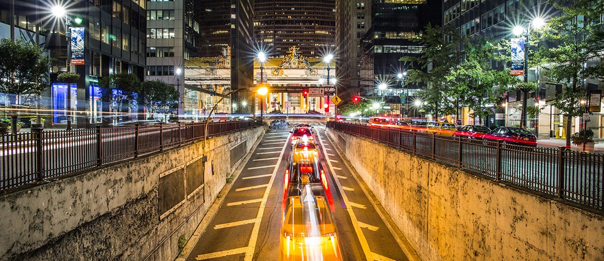
<img class="img-res" src="image.jpg" alt="New York City">
19. Lines & Spacer
To spacer the content you can use hr tag or hr tag with class .spacer for transparent hr.
<hr class="spacer">
20. Spacing
Margin
To easily add margin to an element you can use the class .mb-1 => margin-bottom: 5px or .mt-2 => margin-top: 10px.
The system use letters mb-, mt-, ml-, mr- to determinate the side and 1, 2 or 3 to determinate the space.
Element with margin bottom.
Element with margin top.
Element with margin left.
Element with margin right.
  <div class="mb-2">Element with margin bottom.</div>
  <div class="mt-1">Element with margin top.</div>
  <div class="ml-3">Element with margin left.</div>
  <div class="mr-0">Element with margin right.</div>
Padding
With the same margin login you can set padding, you have to use p instead m, for example .pb-2 => padding-bottom: 10px;
Element with padding bottom.
Element with padding left.
  <div class="pb-2">Element with padding bottom.</div>
  <div class="pl-3">Element with padding left.</div>
Vertical and Horizontal Spacing
You can add horizontal/vertical padding/margin with one class .my-2 => margin-top: 10px; margin-bottom:10px;
Element with padding left and right.
Element with margin-top and bottom.
  <div class="px-2"> Element with padding left and right.</div>
  <div class="my-3">Element with margin-top and bottom.</div>
21. Text Align
You can use .text-left, .text-center or .text-right class to align text easily.
Element with text left.
Element with text center.
Element with text right.
  <p class="text-left">Element with text left.</p>
  <p class="text-center">Element with text center.</p>
  <p class="text-right">Element with text right.</p>
22. Text Cover
Create beautiful Cover in seconds using the .cover class with optional filter (.filter class) over the image.
Home Page Cover Message
Subtitle of the cover full width
Lorem ipsum dolor sit amet, consectetur adipisicing elit. Consectetur maiores, deleniti voluptates perferendis magnam temporibus, iure ratione quia quidem aliquid ex nisi ea. Dignissimos odio, consequatur enim. Autem, expedita, fugit.
Call to action
<section class="cover filter" style="background: url(http://afmarchetti.github.io/alux/image.jpg) center center;background-size: cover;">
  <div class="cover__text grid grid--center">
    <div class="col-80">
      <h1>Home Page Cover Message</h1>
      <h2>Subtitle of the cover full width</h2>
      <p>Lorem ipsum dolor sit amet, consectetur adipisicing elit. Consectetur maiores, deleniti voluptates perferendis magnam temporibus, iure ratione quia quidem aliquid ex nisi ea. Dignissimos odio, consequatur enim. Autem, expedita, fugit.</p>
      <a class="button animate" href="">Call to action</a>
    </div>
  </div>
</section>
23. Tile
Create image Tiles in seconds using the .tile class with optional filter (.filter class) over the image.
<div class="tile filter" style="background: url(http://afmarchetti.github.io/alux/image.jpg) center center;background-size: cover;">
  <div class="tile__text">
    <h3 class="mb-0">Card title</h3>
    <h4 class="light small">Lorem ipsum</h4>
  </div>
</div>
24. Cards
Create Cards in seconds using the .card class.
Lorem ipsum dolor sit amet, consectetur adipisicing elit. Quae molestias deserunt aperiam cum fugit similique non, facilis unde quo tenetur animi eos sunt sit excepturi ducimus veritatis eaque repudiandae doloremque?
Lorem ipsum dolor sit amet, consectetur adipisicing elit. Quae molestias deserunt aperiam cum fugit similique non, facilis unde quo tenetur animi eos sunt sit excepturi ducimus veritatis eaque repudiandae doloremque?
<div class="card">
  <div class="tile filter" style="background: url(http://afmarchetti.github.io/alux/image.jpg) center center;background-size: cover;">
    <div class="tile__text">
      <h3 class="mb-0">Card title</h3>
      <h4 class="light small">Lorem ipsum</h4>
    </div>
  </div>
  <div class="card__copy">
    <p>Lorem ipsum dolor sit amet, consectetur adipisicing elit. Quae molestias deserunt aperiam cum fugit similique non, facilis unde quo tenetur animi eos sunt sit excepturi ducimus veritatis eaque repudiandae doloremque?</p>
  </div>
</div>